
/* =====================================================================
GREENLAND PILATES · CUSTOM CSS
Built by BERMO Collective, Sept 2026.
CONTENTS
1. Brand colors (change a color here and it changes everywhere)
2. Fonts
3. Base spacing
4. Eyebrows (Paragraph 3 text style)
5. Arrow links (a link alone on its own line)
6. Navigation and header button
7. Sections: photo overlay, page heroes, intros, lines under headings
8. Credential line (Paragraph 1 text style)
9. Coach card
10. List rows (a text block that starts with a Heading 3)
11. Rate card (Heading 3 + line + price in Paragraph 3)
12. Quote text style
13. FAQ accordion
14. Events list (Summary block)
15. Page: Home, "Sweat. Stretch. Recover." sessions list
16. Page: Coaches, "Founding instructors" card
17. Footer (every page)
18. Page: Schedule, the Momence container
19. Page: Contact, the map and the form fields
20. Spruce panels on a print (Membership rate card, Coaches rows)
21. Page: Contact, the big flower cutout
22. Page: The Difference, the four rows panel
23. Page: About, the closing line
24. Page: About, phone layout of the essay section
25. Page: About, body text in the two spruce panels
26. Page: About, the pull quote on the floral
NOTES FOR WHOEVER EDITS THIS NEXT
- Squarespace compiles this file as LESS. Write "1 / -1" as ~"1 / -1" and
"332 / 295" as ~"332 / 295", or LESS divides the numbers. Never put
clamp() inside calc(): it breaks every rule in this file.
- After saving, open /site.css and search for "ExecuteError". If it is
there, the last change broke the file.
- Sections 4 to 17 sit inside one "#siteWrapper { }" block. That id is
what lets these rules outrank Squarespace's own theme styles WITHOUT
using !important on colors and sizes, so a color or size picked in the
text editor still wins. !important is kept only for layout
(margins, padding, grid, display) that Squarespace would otherwise
override.
- Rules that name a section-id only apply to that one section. If that
section is deleted or duplicated, the rule stops applying; the comment
above each one says which page and section it is.
- Rules include .ProseMirror so the editor draws text the same way the
live site does.
===================================================================== */
/* ---------------------------------------------------------------------
1. BRAND COLORS
--------------------------------------------------------------------- */
:root {
--gp-spruce: #1E2723; /* dark green, main background (palette swatch 5) */
--gp-plaster: #EFEDE6; /* main text on dark (palette swatch 1) */
--gp-brass: #C79458; /* action color: buttons, links, eyebrows on dark */
--gp-brass-dark: #8C6330; /* brass on light backgrounds (passes contrast) */
--gp-gold-light: #F4DDAE; /* hero eyebrows over photos */
--gp-muted: #A7ADA4; /* secondary text on dark */
--gp-ink-soft: #D6D3C7; /* body copy on dark (bios, answers) */
--gp-muted-on-light: #5E6660; /* secondary text on light */
--gp-ink-on-light: #20281F; /* quote text on light */
--gp-footer-text: #D8D4C6; /* footer links and email */
--gp-rule: rgba(234,231,220,.14); /* thin lines between rows */
--gp-rule-soft: rgba(234,231,220,.08); /* thinner lines inside rate cards */
}
/* ---------------------------------------------------------------------
2. FONTS
Libre Caslon Text italic for the Quote style. Loaded with @font-face
because @import only works at the very top of a stylesheet, and
Squarespace places this file near the end of its own.
--------------------------------------------------------------------- */
@font-face {
font-family: 'Libre Caslon Text';
font-style: italic;
font-weight: 400;
font-display: swap;
src: url(https://fonts.gstatic.com/s/librecaslontext/v5/DdT678IGsGw1aF1JU10PUbTvNNaDMfq95-BDGjG2u9s.woff2) format('woff2');
}
/* ---------------------------------------------------------------------
3. BASE SPACING
Kept outside the #siteWrapper block on purpose: at this low specificity
Squarespace's own paragraph spacing still wins where it should
(last lines, list rows, rate cards).
--------------------------------------------------------------------- */
h1 { margin-top: 0 !important; }
.fe-block p { margin-bottom: 0.4em; }
#siteWrapper {
/* ---------------------------------------------------------------------
4. EYEBROWS (Paragraph 3 text style)
Small tracked caps. Dark brass on light sections, brass on dark ones.
--------------------------------------------------------------------- */
.sqsrte-small {
font-size: 13px;
letter-spacing: .32em;
text-transform: uppercase;
font-weight: 600;
color: var(--gp-brass-dark);
}
[data-section-theme="black"] .sqsrte-small,
[data-section-theme="dark"] .sqsrte-small {
color: var(--gp-brass);
}
/* ---------------------------------------------------------------------
5. ARROW LINKS
A link that sits alone on its own line becomes a brass caps link with
an arrow that slides on hover (Find your time, Directions, and so on).
--------------------------------------------------------------------- */
.sqs-html-content p > a:only-child {
font-family: 'Public Sans', sans-serif;
font-size: 12px;
letter-spacing: .24em;
text-transform: uppercase;
font-weight: 600;
color: var(--gp-brass);
text-decoration: none;
background: none;
white-space: nowrap;
display: inline-block;
margin-top: 10px;
}
.sqs-html-content p > a:only-child::after {
content: "\2192";
display: inline-block;
margin-left: 8px;
letter-spacing: 0;
font-size: 14px;
transition: transform .35s;
}
.sqs-html-content p > a:only-child:hover::after { transform: translateX(6px); }
/* on light sections the arrow link is dark brass so it passes contrast */
[data-section-theme^="white"] .sqs-html-content p > a:only-child,
[data-section-theme^="light"] .sqs-html-content p > a:only-child {
color: var(--gp-brass-dark);
}
/* a phone or email link inside a sentence ("Call or text 603-722-0725") stays plain text */
.sqs-html-content p > a[href^="tel:"],
.sqs-html-content p > a[href^="mailto:"] {
font: inherit;
letter-spacing: inherit;
text-transform: none;
color: inherit;
display: inline;
margin: 0;
white-space: normal;
text-decoration: underline;
text-underline-offset: 3px;
text-decoration-color: var(--gp-brass);
}
.sqs-html-content p > a[href^="tel:"]::after,
.sqs-html-content p > a[href^="mailto:"]::after { content: none; }
/* ---------------------------------------------------------------------
6. NAVIGATION AND HEADER BUTTON
Small tracked caps, soft white, brass underline on hover and on the
current page. Squarespace adds its own left margin to each link; it is
removed so the gap below does all the spacing (36px at 1512 wide).
The header button ("Book a session") matches the page buttons.
--------------------------------------------------------------------- */
.header-nav-item > a,
.header-nav-folder-title {
font-family: 'Public Sans', sans-serif;
font-size: clamp(11px, .85vw, 12.5px);
letter-spacing: .16em;
text-transform: uppercase;
font-weight: 500;
color: rgba(255,255,255,.92);
text-shadow: 0 1px 3px rgba(0,0,0,.8), 0 2px 14px rgba(0,0,0,.5);
background-image: none;
border-bottom: 1px solid transparent;
}
.header-nav-item > a:hover,
.header-nav-item--active > a {
border-bottom-color: var(--gp-brass);
}
.header-nav-list { gap: clamp(20px, 2.4vw, 38px); flex-wrap: nowrap !important; }
.header-nav-item { white-space: nowrap; margin-left: 0 !important; }
/* phone menu links in the display serif */
.header-menu-nav-item a { font-family: 'Libre Caslon Display', Georgia, serif; }
/* BUTTONS: one shape and size everywhere (header, phone menu, every page).
Fluid Engine stretches a button to the box it was drawn in; the width and
height here stop that, so the button is sized by its text and padding. */
.header-actions .btn,
.header-menu-cta .btn,
.sqs-block-button-element {
font-family: 'Public Sans', sans-serif;
font-size: 12.4px;
letter-spacing: .05em;
text-transform: uppercase;
font-weight: 500;
line-height: 1.2;
padding: 15px 26px !important;
width: auto !important;
height: auto !important;
min-height: 0 !important;
flex: 0 0 auto !important;
align-self: center !important;
background: var(--gp-brass);
color: var(--gp-spruce);
border: 0;
border-radius: 0;
}
.sqs-block-button-container {
display: flex !important;
align-items: center;
}
.sqs-block-button-container--left { justify-content: flex-start; }
.sqs-block-button-container--center { justify-content: center; }
.sqs-block-button-container--right { justify-content: flex-end; }
/* narrower desktops: tighter tracking and gaps so every link fits on one row */
@media (max-width: 1200px) {
.header-nav-item > a { letter-spacing: .08em; font-size: 11px; }
.header-nav-list { gap: clamp(18px, 2vw, 24px) !important; }
.header-title-logo img { max-height: 140px; }
}
/* ---------------------------------------------------------------------
7. SECTIONS
--------------------------------------------------------------------- */
/* any section with a background photo gets a 35% spruce overlay so type reads */
.page-section .section-background-overlay {
opacity: .35 !important;
background-color: var(--gp-spruce) !important;
}
/* the first section of every page is its hero: bigger light-gold eyebrow */
.page-section:first-child .sqsrte-small,
section[data-section-id]:first-child .sqsrte-small {
font-size: clamp(15px, 1.45vw, 22px);
letter-spacing: .38em;
font-weight: 700;
color: var(--gp-gold-light);
text-shadow: 0 1px 2px rgba(0,0,0,1), 0 3px 22px rgba(0,0,0,.85);
}
/* hero sentence over a photo: a touch bigger, tighter measure, and a soft
shadow so it reads over the image */
.page-section:first-child .sqs-html-content p:not(.sqsrte-small):not(.sqsrte-large) {
font-size: clamp(16px, 1.15vw, 18px);
line-height: 1.55;
max-width: 46ch;
text-shadow: 0 1px 3px rgba(0,0,0,.75), 0 2px 16px rgba(0,0,0,.45);
}
/* phones: the hero button sits under the sentence, aligned with the text.
Fluid Engine draws phones on its own grid, so the two heroes where the
button was placed above the sentence get their button row set here.
Home hero: section 68ed96d169511f1c89306eee. Membership hero: 6ab48486d8cb4a3ae290cf37. */
.page-section:first-child .sqs-block-button-container { justify-content: flex-start !important; }
@media (max-width: 767px) {
section[data-section-id="68ed96d169511f1c89306eee"] .fe-block:has(.sqs-block-button) { grid-row: ~"16 / 18" !important; }
section[data-section-id="6ab48486d8cb4a3ae290cf37"] .fe-block:has(.sqs-block-button) { grid-row: ~"17 / 19" !important; }
/* The Difference hero: the button was drawn over the sentence on phones */
section[data-section-id="6ab6adba6f4cbf2dd5172f44"] .fe-block:has(.sqs-block-button) { grid-row: ~"10 / 12" !important; }
/* Coaches hero: one row more air between the sentence and the button */
section[data-section-id="6ab466bfb15fc762cd137ce5"] .fe-block:has(.sqs-block-button) { grid-row: ~"9 / 11" !important; }
}
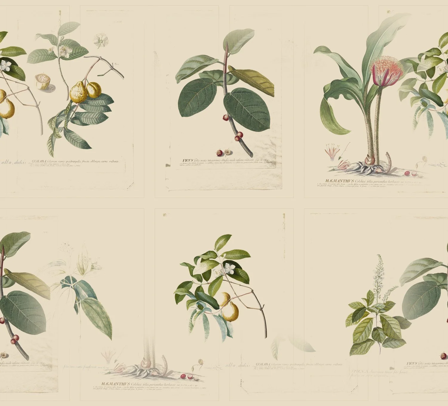
/* FLORAL WALL: the original site's botanical paper under a warm paper veil.
The tile is "floral-wall-seamless-v2.jpg" (the 06 floral wall with its edges
blended so it repeats with no seam; source in website/assets, 900px wide here). Add a section id to this
list to give any section the wall; its own background image is hidden.
Coaches, coach rows: 6ab466bfb15fc762cd137cf0
Schedule, the schedule area: 6ab5cf91c25a4c0b91757822
Schedule, Intro + Privates: 6ab58685eb4ccd1d359cac3c (its cards sit in a spruce box, CSS section 18) */
section[data-section-id="6ab466bfb15fc762cd137cf0"] .section-background,
section[data-section-id="6ab5cf91c25a4c0b91757822"] .section-background,
section[data-section-id="6ab58685eb4ccd1d359cac3c"] .section-background {
background: #E8DCC4 url(https://images.squarespace-cdn.com/content/v2/namespaces/website/libraries/68ed95d9a2bd713a03085daa/ec49ae5e-0495-4407-aa1c-016ad1a49eaf/floral-wall-seamless-v2.jpg) center top / 900px auto repeat;
}
section[data-section-id="6ab466bfb15fc762cd137cf0"] .section-background img,
section[data-section-id="6ab5cf91c25a4c0b91757822"] .section-background img,
section[data-section-id="6ab58685eb4ccd1d359cac3c"] .section-background img { display: none !important; }
section[data-section-id="6ab466bfb15fc762cd137cf0"] .section-background-overlay,
section[data-section-id="6ab5cf91c25a4c0b91757822"] .section-background-overlay,
section[data-section-id="6ab58685eb4ccd1d359cac3c"] .section-background-overlay {
background-color: #E8DCC4 !important;
opacity: .38 !important;
}
/* on dark sections, the paragraph right under a section heading (H2) is muted */
[data-section-theme="black"] .sqs-html-content h2 + p:not([class]),
[data-section-theme="dark"] .sqs-html-content h2 + p:not([class]) {
color: var(--gp-muted);
}
/* on dark sections, the line under any Heading 3 is muted and a little smaller */
[data-section-theme="black"] .sqs-html-content h3 + p {
color: var(--gp-muted);
font-size: clamp(13.5px, .95vw, 16px);
letter-spacing: 0;
margin-top: 6px !important;
}
/* ---------------------------------------------------------------------
8. CREDENTIAL LINE (Paragraph 1 text style)
A coach's certifications under the name: small, lightly tracked, muted.
--------------------------------------------------------------------- */
.sqsrte-large {
font-size: 13px;
line-height: 1.6;
letter-spacing: .06em;
font-weight: 400;
color: var(--gp-muted);
margin-bottom: 22px !important;
}
.sqsrte-large strong { color: var(--gp-ink-soft); font-weight: 500; }
[data-section-theme^="white"] .sqsrte-large,
[data-section-theme^="light"] .sqsrte-large {
color: var(--gp-muted-on-light);
}
[data-section-theme^="white"] .sqsrte-large strong,
[data-section-theme^="light"] .sqsrte-large strong {
color: var(--gp-spruce);
}
/* ---------------------------------------------------------------------
9. COACH CARD
Eyebrow + name (Heading 2) + credential line (Paragraph 1) + bio.
8px eyebrow to name, 10px name to credentials, 22px to the bio,
18px between bio paragraphs, bio in soft ink.
--------------------------------------------------------------------- */
.sqs-html-content .sqsrte-small:has(+ h2 + .sqsrte-large) { margin-bottom: 0 !important; }
.sqs-html-content h2:has(+ .sqsrte-large) {
font-size: clamp(34px, 3.2vw, 56px);
line-height: 1.08;
margin: 8px 0 10px !important;
}
.sqs-html-content .sqsrte-large { margin-top: 0 !important; }
.sqs-html-content .sqsrte-large ~ p { margin-top: 18px !important; margin-bottom: 0 !important; }
.sqs-html-content .sqsrte-large + p { margin-top: 0 !important; }
[data-section-theme="black"] .sqs-html-content .sqsrte-large ~ p:not(.sqsrte-small),
[data-section-theme="dark"] .sqs-html-content .sqsrte-large ~ p:not(.sqsrte-small) {
color: var(--gp-ink-soft);
}
/* Coaches rows (section 6ab466bfb15fc762cd137cf0) between phone and 1366px wide:
the blocks keep the layout they were drawn in, so the type scales with the
viewport, like zooming the full-size page out, instead of a bio running into
the next card. Nothing changes at 1366px and up or on phones. */
@media (min-width: 768px) and (max-width: 1365px) {
section[data-section-id="6ab466bfb15fc762cd137cf0"] .sqs-html-content p:not([class]) { font-size: 1.17vw; }
section[data-section-id="6ab466bfb15fc762cd137cf0"] .sqs-html-content h2 { font-size: 3.15vw; }
section[data-section-id="6ab466bfb15fc762cd137cf0"] .sqs-html-content .sqsrte-small { font-size: .95vw; letter-spacing: .28em; }
section[data-section-id="6ab466bfb15fc762cd137cf0"] .sqs-html-content .sqsrte-large { font-size: .95vw; }
section[data-section-id="6ab466bfb15fc762cd137cf0"] .sqs-html-content p > a:only-child { font-size: .88vw; }
}
/* ---------------------------------------------------------------------
10. LIST ROWS
A text block that STARTS with a Heading 3 and has no prices lays out as
rows: name (Heading 3) on the left, its line on the right, a thin rule
between rows. To add a row: type a Heading 3, then a normal line.
--------------------------------------------------------------------- */
:is(.sqs-html-content, .ProseMirror):has(> h3:first-child):not(:has(h3 + p + .sqsrte-small)) {
display: grid !important;
grid-template-columns: minmax(0, 1fr) minmax(0, 1.3fr);
border-top: 1px solid var(--gp-rule);
}
:is(.sqs-html-content, .ProseMirror):has(> h3:first-child):not(:has(h3 + p + .sqsrte-small)) > * {
grid-column: ~"1 / -1";
}
:is(.sqs-html-content, .ProseMirror):has(> h3:first-child):not(:has(h3 + p + .sqsrte-small)) > h3 {
grid-column: 1;
margin: 0 !important;
padding: clamp(26px, 3.6vh, 48px) clamp(34px, 4.5vw, 80px) clamp(26px, 3.6vh, 48px) 0 !important;
border-bottom: 1px solid var(--gp-rule);
font-size: clamp(30px, 2.8vw, 48px);
line-height: 1.08;
}
:is(.sqs-html-content, .ProseMirror):has(> h3:first-child):not(:has(h3 + p + .sqsrte-small)) > h3 + p {
grid-column: 2;
margin: 0 !important;
padding: clamp(34px, 4.4vh, 56px) 0 clamp(26px, 3.6vh, 48px) !important;
border-bottom: 1px solid var(--gp-rule);
font-size: clamp(15.5px, 1.05vw, 18px);
}
@media (max-width: 767px) {
:is(.sqs-html-content, .ProseMirror):has(> h3:first-child):not(:has(h3 + p + .sqsrte-small)) {
grid-template-columns: 1fr;
}
:is(.sqs-html-content, .ProseMirror):has(> h3:first-child):not(:has(h3 + p + .sqsrte-small)) > h3 {
grid-column: 1;
border-bottom: 0;
padding: 24px 0 10px !important;
}
:is(.sqs-html-content, .ProseMirror):has(> h3:first-child):not(:has(h3 + p + .sqsrte-small)) > h3 + p {
grid-column: 1;
padding: 0 0 24px !important;
}
}
/* ---------------------------------------------------------------------
11. RATE CARD
A text block with rates (Heading 3 name, a line, the price in
Paragraph 3) lays out one rate per row: name | line | price at the
right, thin rules. A Paragraph 3 line that is not a price is a group
label with a rule under it. Other lines span the full width, muted.
Phones stack everything in one column.
--------------------------------------------------------------------- */
/* a group label, or a paragraph that follows a price, gets breathing room */
.sqs-html-content h3 + p + .sqsrte-small + .sqsrte-small { margin-top: 2.6em !important; }
.sqs-html-content h3 + p + .sqsrte-small + p:not([class]) { margin-top: 2.2em !important; }
:is(.sqs-html-content, .ProseMirror):has(h3 + p + .sqsrte-small) {
display: grid !important;
grid-template-columns: minmax(0, 1fr) minmax(0, 1.25fr) auto;
}
:is(.sqs-html-content, .ProseMirror):has(h3 + p + .sqsrte-small) > * {
grid-column: ~"1 / -1";
}
:is(.sqs-html-content, .ProseMirror):has(h3 + p + .sqsrte-small) > h3 {
grid-column: 1;
margin: 0 !important;
padding: clamp(12px, 1.8vh, 20px) clamp(20px, 3vw, 48px) clamp(12px, 1.8vh, 20px) 0 !important;
border-bottom: 1px solid var(--gp-rule-soft);
font-size: clamp(20px, 1.8vw, 28px);
line-height: 1.15;
}
:is(.sqs-html-content, .ProseMirror):has(h3 + p + .sqsrte-small) > h3 + p {
grid-column: 2;
margin: 0 !important;
padding: clamp(17px, 2.3vh, 25px) clamp(20px, 3vw, 48px) clamp(12px, 1.8vh, 20px) 0 !important;
border-bottom: 1px solid var(--gp-rule-soft);
font-size: clamp(14.5px, 1vw, 16.5px);
}
:is(.sqs-html-content, .ProseMirror):has(h3 + p + .sqsrte-small) > h3 + p + .sqsrte-small {
grid-column: 3;
margin: 0 !important;
padding: clamp(19px, 2.5vh, 27px) 0 clamp(12px, 1.8vh, 20px) !important;
border-bottom: 1px solid var(--gp-rule-soft);
text-align: right;
white-space: nowrap;
}
:is(.sqs-html-content, .ProseMirror):has(h3 + p + .sqsrte-small) > .sqsrte-small:not(h3 + p + .sqsrte-small) {
margin: clamp(34px, 4.6vh, 56px) 0 0 !important;
padding: 0 0 12px !important;
border-bottom: 1px solid var(--gp-rule);
}
:is(.sqs-html-content, .ProseMirror):has(h3 + p + .sqsrte-small) > .sqsrte-small:first-child {
margin-top: 0 !important;
}
:is(.sqs-html-content, .ProseMirror):has(h3 + p + .sqsrte-small) > p:not([class]):not(h3 + p) {
margin: clamp(26px, 4vh, 44px) 0 0 !important;
max-width: 62ch;
color: var(--gp-muted);
}
@media (max-width: 767px) {
:is(.sqs-html-content, .ProseMirror):has(h3 + p + .sqsrte-small) {
grid-template-columns: 1fr;
}
:is(.sqs-html-content, .ProseMirror):has(h3 + p + .sqsrte-small) > h3,
:is(.sqs-html-content, .ProseMirror):has(h3 + p + .sqsrte-small) > h3 + p,
:is(.sqs-html-content, .ProseMirror):has(h3 + p + .sqsrte-small) > h3 + p + .sqsrte-small {
grid-column: 1;
border-bottom: 0;
text-align: left;
padding: 0 !important;
}
:is(.sqs-html-content, .ProseMirror):has(h3 + p + .sqsrte-small) > h3 { padding-top: 16px !important; }
:is(.sqs-html-content, .ProseMirror):has(h3 + p + .sqsrte-small) > h3 + p { padding-top: 4px !important; }
:is(.sqs-html-content, .ProseMirror):has(h3 + p + .sqsrte-small) > h3 + p + .sqsrte-small {
padding: 6px 0 16px !important;
border-bottom: 1px solid var(--gp-rule-soft);
}
}
/* ---------------------------------------------------------------------
12. QUOTE TEXT STYLE
The Quote style is the pull line: Libre Caslon Text italic, centered.
Used for lines like "Start here. No experience needed..."
--------------------------------------------------------------------- */
:is(.sqs-html-content, .ProseMirror) blockquote,
:is(.sqs-html-content, .ProseMirror) blockquote p {
font-family: 'Libre Caslon Text', Georgia, serif;
font-style: italic;
font-weight: 400;
font-size: clamp(22px, 2.2vw, 34px);
line-height: 1.5;
letter-spacing: 0;
color: var(--gp-ink-soft);
text-align: center;
text-transform: none;
}
:is(.sqs-html-content, .ProseMirror) blockquote {
max-width: 36ch;
margin: 18px auto 0 !important;
padding: 0 !important;
border: 0 !important;
}
:is(.sqs-html-content, .ProseMirror) blockquote::before,
:is(.sqs-html-content, .ProseMirror) blockquote::after {
display: none !important;
content: none !important;
}
[data-section-theme^="white"] :is(.sqs-html-content, .ProseMirror) blockquote,
[data-section-theme^="white"] :is(.sqs-html-content, .ProseMirror) blockquote p,
[data-section-theme^="light"] :is(.sqs-html-content, .ProseMirror) blockquote,
[data-section-theme^="light"] :is(.sqs-html-content, .ProseMirror) blockquote p {
color: var(--gp-ink-on-light);
}
/* ---------------------------------------------------------------------
13. FAQ ACCORDION
Question in Caslon like a list row, answer in soft ink, thin rules,
brass plus sign. Matches the list rows in section 10.
--------------------------------------------------------------------- */
.sqs-block-accordion .accordion-divider { background-color: var(--gp-rule); }
.sqs-block-accordion .accordion-item__click-target { padding: clamp(18px, 2.4vh, 26px) 0; }
.sqs-block-accordion .accordion-item__title {
font-family: 'Libre Caslon Display', Georgia, serif;
font-size: clamp(20px, 1.6vw, 24px);
line-height: 1.2;
color: var(--gp-plaster);
}
.sqs-block-accordion .accordion-item__description,
.sqs-block-accordion .accordion-item__description p {
font-family: 'Public Sans', sans-serif;
font-size: clamp(14.5px, 1vw, 16px);
line-height: 1.6;
color: var(--gp-ink-soft);
max-width: 62ch;
}
.sqs-block-accordion .accordion-item__description { padding-bottom: clamp(18px, 2.4vh, 26px); }
.sqs-block-accordion .plus__horizontal-line,
.sqs-block-accordion .plus__vertical-line { background-color: var(--gp-brass); }
/* ---------------------------------------------------------------------
14. EVENTS LIST (Summary block)
The "Upcoming events" list on Coaches: title in Caslon, date as an
eyebrow, excerpt muted, "Read more" as the brass arrow link.
--------------------------------------------------------------------- */
.sqs-block-summary-v2 .summary-title,
.sqs-block-summary-v2 .summary-title a {
font-family: 'Libre Caslon Display', Georgia, serif;
font-size: clamp(22px, 1.9vw, 28px);
line-height: 1.15;
color: var(--gp-plaster);
}
.sqs-block-summary-v2 .summary-metadata-item,
.sqs-block-summary-v2 .summary-metadata-item a {
font-family: 'Public Sans', sans-serif;
font-size: 12px;
letter-spacing: .24em;
text-transform: uppercase;
font-weight: 600;
color: var(--gp-brass);
}
.sqs-block-summary-v2 .summary-excerpt,
.sqs-block-summary-v2 .summary-excerpt p {
font-family: 'Public Sans', sans-serif;
font-size: clamp(14.5px, 1vw, 16px);
line-height: 1.6;
color: var(--gp-muted);
}
.sqs-block-summary-v2 .summary-read-more-link {
font-family: 'Public Sans', sans-serif;
font-size: 12px;
letter-spacing: .24em;
text-transform: uppercase;
font-weight: 600;
color: var(--gp-brass);
text-decoration: none;
}
/* ---------------------------------------------------------------------
15. PAGE: HOME · "Sweat. Stretch. Recover." sessions list
section-id 6ab42dc0f2ab985542bc7ead
Intro paragraph muted, centered, 56ch. Each session is a row:
Desktop: name above its line on the left, "Find your time" on the
right, centered in the row, one rule under the row.
Phone: name left with "Find your time" on the same line at the right,
the line below.
(.page-section is in the selector on purpose: it outranks section 10.)
--------------------------------------------------------------------- */
section[data-section-id="6ab42dc0f2ab985542bc7ead"] .sqs-html-content h2 + p {
color: var(--gp-muted);
font-size: clamp(15px, 1.05vw, 17.5px);
max-width: 56ch;
margin-left: auto !important;
margin-right: auto !important;
text-align: center;
letter-spacing: 0;
}
section[data-section-id="6ab42dc0f2ab985542bc7ead"].page-section :is(.sqs-html-content, .ProseMirror):has(> h3:first-child) {
grid-template-columns: minmax(0, 1fr) auto !important;
grid-auto-flow: row dense !important;
column-gap: 0;
}
section[data-section-id="6ab42dc0f2ab985542bc7ead"].page-section :is(.sqs-html-content, .ProseMirror):has(> h3:first-child) > h3 {
grid-column: 1 !important;
border-bottom: 0 !important;
padding: clamp(28px, 3.6vh, 44px) 0 0 !important;
}
section[data-section-id="6ab42dc0f2ab985542bc7ead"].page-section :is(.sqs-html-content, .ProseMirror):has(> h3:first-child) > h3 + p {
grid-column: 1 !important;
padding: 12px 0 clamp(24px, 3.2vh, 36px) !important;
border-bottom: 1px solid var(--gp-rule);
}
section[data-section-id="6ab42dc0f2ab985542bc7ead"].page-section :is(.sqs-html-content, .ProseMirror):has(> h3:first-child) > p:has(> a:only-child) {
grid-column: 2 !important;
grid-row: span 2;
align-self: stretch;
display: flex;
align-items: center;
justify-content: flex-end;
margin: 0 !important;
padding: 0 0 0 clamp(24px, 3vw, 48px) !important;
border-bottom: 1px solid var(--gp-rule);
}
section[data-section-id="6ab42dc0f2ab985542bc7ead"].page-section :is(.sqs-html-content, .ProseMirror):has(> h3:first-child) > p:has(> a:only-child) > a {
margin-top: 0 !important;
}
@media (max-width: 767px) {
section[data-section-id="6ab42dc0f2ab985542bc7ead"].page-section :is(.sqs-html-content, .ProseMirror):has(> h3:first-child) {
grid-template-columns: minmax(0, 1fr) auto !important;
grid-auto-flow: row dense !important;
column-gap: 12px;
}
section[data-section-id="6ab42dc0f2ab985542bc7ead"].page-section :is(.sqs-html-content, .ProseMirror):has(> h3:first-child) > h3 {
grid-column: 1 !important;
padding: 24px 0 10px !important;
}
section[data-section-id="6ab42dc0f2ab985542bc7ead"].page-section :is(.sqs-html-content, .ProseMirror):has(> h3:first-child) > h3 + p {
padding: 0 0 24px !important;
}
section[data-section-id="6ab42dc0f2ab985542bc7ead"].page-section :is(.sqs-html-content, .ProseMirror):has(> h3:first-child) > p:not(:has(> a:only-child)) {
grid-column: ~"1 / -1" !important;
}
section[data-section-id="6ab42dc0f2ab985542bc7ead"].page-section :is(.sqs-html-content, .ProseMirror):has(> h3:first-child) > p:has(> a:only-child) {
grid-column: 2 !important;
grid-row: auto;
display: block;
align-self: center;
justify-self: end;
margin: 0 !important;
padding: 0 !important;
border-bottom: 0;
}
}
/* ---------------------------------------------------------------------
16. PAGE: COACHES · "Founding instructors" card
section-id 6ab466bfb15fc762cd137cf0 (the section with the coach rows)
Same rhythm as the coach cards: eyebrow > heading 8px,
heading > sentence 22px, sentence > arrow link 18px. Layout only.
--------------------------------------------------------------------- */
section[data-section-id="6ab466bfb15fc762cd137cf0"] :is(.sqs-html-content, .ProseMirror) .sqsrte-small:has(+ h2:not(:has(+ .sqsrte-large))) {
margin-bottom: 0 !important;
}
section[data-section-id="6ab466bfb15fc762cd137cf0"] :is(.sqs-html-content, .ProseMirror) h2:not(:has(+ .sqsrte-large)) {
margin-top: 8px !important;
margin-bottom: 0 !important;
}
section[data-section-id="6ab466bfb15fc762cd137cf0"] :is(.sqs-html-content, .ProseMirror) h2:not(:has(+ .sqsrte-large)) + p {
margin-top: 22px !important;
}
section[data-section-id="6ab466bfb15fc762cd137cf0"] :is(.sqs-html-content, .ProseMirror) h2:not(:has(+ .sqsrte-large)) + p + p {
margin-top: 18px !important;
}
/* coach photos fill their box (cropped) instead of spilling past it:
a portrait set to "Fit" in a 12-row box drew 700px tall and ran over the
divider line and the next coach */
section[data-section-id="6ab466bfb15fc762cd137cf0"] .sqs-block-image .fluid-image-container,
section[data-section-id="6ab466bfb15fc762cd137cf0"] .sqs-block-image .fluid-image-animation-wrapper {
height: 100% !important;
}
section[data-section-id="6ab466bfb15fc762cd137cf0"] .sqs-block-image img {
width: 100% !important;
height: 100% !important;
object-fit: cover !important;
object-position: center top !important;
}
/* ---------------------------------------------------------------------
17. FOOTER (every page)
Plaid tile repeated at 1000px under a 62% spruce veil, 2px brass line
on top. Mark on the left; links, email + phone + Instagram, and the
(c) line with the BERMO credit on the right.
The plaid is set HERE, not by the footer's background image in the
editor (that image is hidden). To change the plaid, replace the URL.
--------------------------------------------------------------------- */
#footer-sections .page-section {
position: relative;
background: var(--gp-spruce) url(https://images.squarespace-cdn.com/content/v2/namespaces/website/libraries/68ed95d9a2bd713a03085daa/77f5e8bf-ca17-47dc-907b-fdc67326cb48/plaid-tile.jpg) center top / 1000px auto repeat !important;

}
#footer-sections .page-section .section-background { display: none !important; }
/* Squarespace paints a solid layer here that would hide the plaid */
#footer-sections .page-section > .section-border { background: transparent !important; }
#footer-sections .page-section::before {
content: "";
position: absolute;
inset: 0;
z-index: 0;
pointer-events: none;
background: radial-gradient(ellipse 120% 100% at 50% 0%, rgba(0,0,0,.25), transparent 55%), rgba(22,29,26,.62);
}
#footer-sections .page-section::after {
content: "";
position: absolute;
left: 0;
right: 0;
top: 0;
height: 2px;
z-index: 1;
pointer-events: none;
background: rgba(199,148,88,.45);
}
#footer-sections .page-section > .content-wrapper { position: relative; z-index: 2; }
/* links row: plain caps, no arrow */
#footer-sections :is(.sqs-html-content, .ProseMirror):has(> p + p + p > a:only-child) {
display: flex;
flex-wrap: wrap;
justify-content: flex-end;
gap: 4px clamp(16px, 2vw, 28px);
}
#footer-sections :is(.sqs-html-content, .ProseMirror):has(> p + p + p > a:only-child) > p { margin: 0 !important; }
#footer-sections :is(.sqs-html-content, .ProseMirror) p > a:only-child {
font-size: 11px;
letter-spacing: .18em;
font-weight: 500;
color: var(--gp-footer-text);
text-decoration: none;
border: 0;
white-space: nowrap;
}
#footer-sections :is(.sqs-html-content, .ProseMirror) p > a:only-child::after { content: none !important; }
#footer-sections :is(.sqs-html-content, .ProseMirror) p > a:only-child:hover { color: #FFFFFF; }
/* the right-column lines (phone, email, (c), credit) sit in narrow blocks:
let each line take its natural width and hang to the left from the block's
right edge, so nothing wraps or clips whatever the block width is */
#footer-sections :is(.sqs-html-content, .ProseMirror):not(:has(> p + p + p > a:only-child)) > p {
float: right;
clear: right;
width: max-content;
max-width: none;
white-space: nowrap;
text-align: right;
}
#footer-sections :is(.sqs-html-content, .ProseMirror):not(:has(> p + p + p > a:only-child))::after {
content: "";
display: block;
clear: both;
}
/* email and phone: sentence case */
#footer-sections :is(.sqs-html-content, .ProseMirror) p > a[href^="mailto:"],
#footer-sections :is(.sqs-html-content, .ProseMirror) p > a[href^="tel:"] {
font-size: 14px;
letter-spacing: 0;
text-transform: none;
font-weight: 400;
}
/* room on the right of the email for the Instagram icon */
#footer-sections :is(.sqs-html-content, .ProseMirror) p:has(> a[href^="mailto:"]) { padding-right: 32px; }
/* (c) line and the "Site by BERMO Collective" credit under it */
#footer-sections :is(.sqs-html-content, .ProseMirror) p:not(:has(> a:only-child)) {
margin: 0;
font-size: 12.5px;
line-height: 1.5;
color: rgba(216,212,198,.72);
}
#footer-sections :is(.sqs-html-content, .ProseMirror) p:not(:has(> a:only-child)) a {
color: rgba(216,212,198,.72);
text-decoration: none;
border: 0;
}
#footer-sections :is(.sqs-html-content, .ProseMirror) p:not(:has(> a:only-child)) a:hover { color: #FFFFFF; }
/* "Site by BERMO Collective" is one link on its own line: keep it in the (c) style, not the nav style */
#footer-sections :is(.sqs-html-content, .ProseMirror) p > a[href*="bermoco.com"] {
font-size: 12.5px;
letter-spacing: 0;
text-transform: none;
font-weight: 400;
color: rgba(216,212,198,.72);
white-space: normal;
}
/* mark: bottom-left, soft */
#footer-sections .sqs-block-image .fluid-image-animation-wrapper {
justify-content: flex-start !important;
align-items: flex-end !important;
}
#footer-sections .sqs-block-image .fluid-image-container {
height: clamp(78px, 7.5vw, 108px) !important;
width: auto !important;
aspect-ratio: ~"332 / 295";
}
#footer-sections .sqs-block-image img {
opacity: .62;
object-fit: contain !important;
object-position: left bottom !important;
}
@media (max-width: 767px) {
#footer-sections :is(.sqs-html-content, .ProseMirror):has(> p + p + p > a:only-child) {
flex-direction: column;
align-items: flex-start;
gap: 2px;
}
#footer-sections :is(.sqs-html-content, .ProseMirror) p > a:only-child {
font-size: 10px;
letter-spacing: .16em;
}
#footer-sections :is(.sqs-html-content, .ProseMirror) p:not(:has(> a:only-child)) {
font-size: 10.5px;
line-height: 1.45;
color: rgba(216,212,198,.55);
}
#footer-sections :is(.sqs-html-content, .ProseMirror) p > a[href^="mailto:"],
#footer-sections :is(.sqs-html-content, .ProseMirror) p > a[href^="tel:"] { font-size: 12.5px; }
#footer-sections :is(.sqs-html-content, .ProseMirror) p > a[href*="bermoco.com"] { font-size: 10.5px; color: rgba(216,212,198,.55); }
/* phones: blocks stack full width, so lines wrap normally again */
#footer-sections :is(.sqs-html-content, .ProseMirror):not(:has(> p + p + p > a:only-child)) > p {
float: none;
width: auto;
white-space: normal;
text-align: left;
}
#footer-sections .sqs-block-image img { opacity: .75; }
}
/* ---------------------------------------------------------------------
18. PAGE: SCHEDULE (/schedule) · the Momence container
The Code block on the Schedule page holds <div class="gp-momence">.
Until the Momence widget arrives it shows the "coming soon" lines;
when Sarah's snippet is pasted inside that div, this panel is its frame
and nothing else on the page moves.
--------------------------------------------------------------------- */
.gp-momence {
min-height: 640px;
display: flex;
flex-direction: column;
align-items: center;
justify-content: center;
text-align: center;
padding: clamp(40px, 6vh, 72px) 24px;
background: var(--gp-spruce);
border: 1px solid rgba(199,148,88,.45);
box-shadow: 0 30px 60px rgba(22,29,26,.22);
}
.gp-momence h3 {
font-family: 'Libre Caslon Display', Georgia, serif;
font-weight: 400;
font-size: clamp(26px, 2.4vw, 36px);
line-height: 1.15;
color: var(--gp-plaster);
margin: 0 0 12px;
}
.gp-momence p {
font-family: 'Public Sans', sans-serif;
font-size: clamp(14.5px, 1vw, 16px);
line-height: 1.6;
color: var(--gp-muted);
max-width: 46ch;
margin: 0;
}
/* the widget itself fills the panel */
.gp-momence iframe,
.gp-momence > div { width: 100%; }
/* Intro + Privates cards (section 6ab58685eb4ccd1d359cac3c): the whole grid sits in
the same spruce box as the schedule panel, on the floral wall */
section[data-section-id="6ab58685eb4ccd1d359cac3c"] .fluid-engine {
background: var(--gp-spruce);
border: 1px solid rgba(199,148,88,.45);
box-shadow: 0 30px 60px rgba(22,29,26,.22);
margin: 0 8.333% !important;
padding: clamp(32px, 4vw, 64px) clamp(24px, 3vw, 56px) !important;
}
/* the two cards are the same height (rows 2-10); each card's arrow link sits at
the bottom of its block, so both arrows share one baseline whatever wraps */
section[data-section-id="6ab58685eb4ccd1d359cac3c"] .fe-block .sqs-block { height: 100% !important; }
section[data-section-id="6ab58685eb4ccd1d359cac3c"] .fe-block .sqs-block-content {
height: 100% !important;
display: flex !important;
flex-direction: column;
}
section[data-section-id="6ab58685eb4ccd1d359cac3c"] .fe-block .sqs-text-block-container,
section[data-section-id="6ab58685eb4ccd1d359cac3c"] .fe-block .sqs-html-content,
section[data-section-id="6ab58685eb4ccd1d359cac3c"] .fe-block .sqs-html-content > div,
section[data-section-id="6ab58685eb4ccd1d359cac3c"] .fe-block .sqs-html-content > div > div,
section[data-section-id="6ab58685eb4ccd1d359cac3c"] .fe-block .ProseMirror {
flex: 1 1 auto !important;
display: flex !important;
flex-direction: column;
}
section[data-section-id="6ab58685eb4ccd1d359cac3c"] .fe-block .sqs-html-content > p:last-of-type,
section[data-section-id="6ab58685eb4ccd1d359cac3c"] .fe-block .ProseMirror > p:last-of-type {
margin-top: auto !important;
padding-top: 18px;
}
@media (max-width: 767px) {
.gp-momence { min-height: 420px; padding: 40px 18px; }
/* Intro + Privates cards stack: air between the Intro card and the Privates card */
section[data-section-id="6ab58685eb4ccd1d359cac3c"] .fluid-engine > .fe-block:first-child { margin-bottom: 28px; }
/* the pricing link is long: let it wrap on phones */
section[data-section-id="6ab58685eb4ccd1d359cac38"] .sqs-html-content p > a:only-child { white-space: normal; }
section[data-section-id="6ab58685eb4ccd1d359cac3c"] .fluid-engine { margin: 0 !important; padding: 28px 20px !important; }
section[data-section-id="6ab58685eb4ccd1d359cac3c"] .fe-block .sqs-block-content,
section[data-section-id="6ab58685eb4ccd1d359cac3c"] .fe-block .sqs-text-block-container,
section[data-section-id="6ab58685eb4ccd1d359cac3c"] .fe-block .sqs-html-content,
section[data-section-id="6ab58685eb4ccd1d359cac3c"] .fe-block .sqs-html-content > div,
section[data-section-id="6ab58685eb4ccd1d359cac3c"] .fe-block .sqs-html-content > div > div,
section[data-section-id="6ab58685eb4ccd1d359cac3c"] .fe-block .ProseMirror { display: block !important; height: auto !important; }
}
/* ---------------------------------------------------------------------
19. PAGE: CONTACT · the map and the form fields
The map image (block-26ff3a6b3f7176f820de, section 68ed96d169511f1c89306edb)
and every form field get the same 1px brass hairline as the schedule
panel and the cards box.
--------------------------------------------------------------------- */
section[data-section-id="68ed96d169511f1c89306edb"] #block-26ff3a6b3f7176f820de .fluid-image-container,
section[data-section-id="68ed96d169511f1c89306edb"] #block-26ff3a6b3f7176f820de img {
box-shadow: inset 0 0 0 1px rgba(199,148,88,.45);
outline: 1px solid rgba(199,148,88,.45);
outline-offset: -1px;
}
/* Squarespace draws the field edge with a box-shadow from its own variable, so
the hairline is set the same way (!important: the theme's rule outranks the id) */
.form-block input:not([type="checkbox"]):not([type="radio"]):not([type="submit"]),
.form-block textarea,
.form-block select {
box-shadow: inset 0 0 0 1px rgba(199,148,88,.45) !important;
border-color: transparent;
border-radius: 0;
}
.form-block input:not([type="checkbox"]):not([type="radio"]):not([type="submit"]):focus,
.form-block textarea:focus,
.form-block select:focus {
box-shadow: inset 0 0 0 1px var(--gp-brass) !important;
outline: none;
}
.form-block input[type="checkbox"] { accent-color: var(--gp-brass); }
/* ---------------------------------------------------------------------
20. SPRUCE PANELS ON A PRINT (Shape blocks)
Lexi's spruce rectangles on the Membership rate card (plaid) and the
Coaches rows (floral) get the same 1px brass hairline as the schedule
panel and the cards box, so every box on a print matches.
Membership Class Types: 6ab48486d8cb4a3ae290cf3f · Membership rate card: 6ab4881b426b0977764be6c6
Coaches rows: 6ab466bfb15fc762cd137cf0 · The Difference rows: 6ab6adba6f4cbf2dd5172f4c · About panels: 6ab6b080031058244499c22a
--------------------------------------------------------------------- */
section[data-section-id="6ab48486d8cb4a3ae290cf3f"] svg.sqs-shape-rectangle,
section[data-section-id="6ab4881b426b0977764be6c6"] svg.sqs-shape-rectangle,
section[data-section-id="6ab466bfb15fc762cd137cf0"] svg.sqs-shape-rectangle,
section[data-section-id="6ab6adba6f4cbf2dd5172f4c"] svg.sqs-shape-rectangle,
section[data-section-id="6ab6b080031058244499c22a"] svg.sqs-shape-rectangle {
outline: 1px solid rgba(199,148,88,.45);
outline-offset: -1px;
}
/* Contact FAQ (6ab5720cf05d2e0a5815e477): the box is the section's inset plaid
background, so the hairline sits on that */
section[data-section-id="6ab5720cf05d2e0a5815e477"] .section-background { position: absolute; }
section[data-section-id="6ab5720cf05d2e0a5815e477"] .section-background::after {
content: "";
position: absolute;
inset: 0;
z-index: 2;
pointer-events: none;
box-shadow: inset 0 0 0 1px rgba(199,148,88,.45);
}
/* ---------------------------------------------------------------------
21. PAGE: CONTACT · the big flower cutout
The flower image block (the "18.png" upload) in the Contact header
section slides off the left edge and sits behind the form. The block
keeps its grid position and its own Design settings (opacity is set in
the editor, not here); the CSS only adds the slide, shows the whole
image, and removes the block's overlay tint. The section clips sideways
only, so nothing scrolls and no leaf is cut. Phones: hidden, because the
mobile grid gives the block a 139px box.
--------------------------------------------------------------------- */
section[data-section-id="68ed96d169511f1c89306edb"] {
overflow-x: clip;
overflow-y: visible;
}
section[data-section-id="68ed96d169511f1c89306edb"] .fe-block:has(img[src*="18.png"]) {
z-index: 0 !important;
transform: translateX(-26%); /* portrait image in a landscape box: 26% of the box = 45% of the flower */
pointer-events: none;
}
section[data-section-id="68ed96d169511f1c89306edb"] .fe-block:has(img[src*="18.png"]) img {
object-fit: contain !important;
object-position: left bottom !important;
}
section[data-section-id="68ed96d169511f1c89306edb"] .fe-block:has(img[src*="18.png"]) .fluidImageOverlay {
display: none !important;
}
@media (max-width: 767px) {
section[data-section-id="68ed96d169511f1c89306edb"] .fe-block:has(img[src*="18.png"]) { display: none !important; }
}
/* ---------------------------------------------------------------------
22. PAGE: THE DIFFERENCE · the four rows panel
Section 6ab6adba6f4cbf2dd5172f4c (plaid). Lexi's spruce panel holds ONE
text block with the four rows (eyebrow / Heading 2 / paragraph each),
then her image block below. The editor pushed the panel and the image
down when the words went in, so the positions are pinned here and the
grid is trimmed to fit. The rows stack, with a hairline between them.
--------------------------------------------------------------------- */
@media (min-width: 768px) {
section[data-section-id="6ab6adba6f4cbf2dd5172f4c"] .fluid-engine {
grid-template-rows: ~"repeat(31, minmax(calc(var(--container-width) * var(--row-height-scaling-factor)), auto))" !important;
}
section[data-section-id="6ab6adba6f4cbf2dd5172f4c"] .fe-block-c9782fea506ea52ec7a9 { grid-area: ~"1 / 2 / 16 / 26" !important; } /* spruce panel */
section[data-section-id="6ab6adba6f4cbf2dd5172f4c"] .fe-block-yui_3_17_2_1_1790368264486_2951 { grid-area: ~"2 / 3 / 15 / 25" !important; } /* the rows */
section[data-section-id="6ab6adba6f4cbf2dd5172f4c"] .fe-block-yui_3_17_2_1_1790357133211_20098 { grid-area: ~"18 / 2 / 31 / 26" !important; } /* photo band */
}
section[data-section-id="6ab6adba6f4cbf2dd5172f4c"] .fe-block-yui_3_17_2_1_1790368264486_2951 :is(.sqs-html-content, .ProseMirror) {
display: grid;
grid-template-columns: minmax(0, 1fr) minmax(0, 1.35fr);
column-gap: 0;
padding: 26px 32px;
}
/* each row: eyebrow and headline share the left cell (the headline leaves room above itself), paragraphs on the right */
section[data-section-id="6ab6adba6f4cbf2dd5172f4c"] .fe-block-yui_3_17_2_1_1790368264486_2951 :is(.sqs-html-content, .ProseMirror) .sqsrte-small {
grid-column: 1;
align-self: start;
margin: 0 !important;
padding-right: 56px;
}
section[data-section-id="6ab6adba6f4cbf2dd5172f4c"] .fe-block-yui_3_17_2_1_1790368264486_2951 :is(.sqs-html-content, .ProseMirror) h2 {
grid-column: 1;
align-self: start;
margin: 0 !important;
padding: 30px 56px 0 0;
}
section[data-section-id="6ab6adba6f4cbf2dd5172f4c"] .fe-block-yui_3_17_2_1_1790368264486_2951 :is(.sqs-html-content, .ProseMirror) p:not(.sqsrte-small) {
grid-column: 2;
align-self: start;
max-width: 58ch;
margin: 0 0 40px !important;
font-size: 16px;
line-height: 1.6;
color: var(--gp-ink-soft);
}
section[data-section-id="6ab6adba6f4cbf2dd5172f4c"] .fe-block-yui_3_17_2_1_1790368264486_2951 :is(.sqs-html-content, .ProseMirror) > :nth-child(1) { grid-row: 1; grid-column: 1; }
section[data-section-id="6ab6adba6f4cbf2dd5172f4c"] .fe-block-yui_3_17_2_1_1790368264486_2951 :is(.sqs-html-content, .ProseMirror) > :nth-child(2) { grid-row: 1; grid-column: 1; }
section[data-section-id="6ab6adba6f4cbf2dd5172f4c"] .fe-block-yui_3_17_2_1_1790368264486_2951 :is(.sqs-html-content, .ProseMirror) > :nth-child(3) { grid-row: 1; grid-column: 2; }
section[data-section-id="6ab6adba6f4cbf2dd5172f4c"] .fe-block-yui_3_17_2_1_1790368264486_2951 :is(.sqs-html-content, .ProseMirror) > :nth-child(4) { grid-row: 2; grid-column: 1; }
section[data-section-id="6ab6adba6f4cbf2dd5172f4c"] .fe-block-yui_3_17_2_1_1790368264486_2951 :is(.sqs-html-content, .ProseMirror) > :nth-child(5) { grid-row: 2; grid-column: 1; }
section[data-section-id="6ab6adba6f4cbf2dd5172f4c"] .fe-block-yui_3_17_2_1_1790368264486_2951 :is(.sqs-html-content, .ProseMirror) > :nth-child(6) { grid-row: 2; grid-column: 2; }
section[data-section-id="6ab6adba6f4cbf2dd5172f4c"] .fe-block-yui_3_17_2_1_1790368264486_2951 :is(.sqs-html-content, .ProseMirror) > :nth-child(7) { grid-row: 3; grid-column: 2; }
section[data-section-id="6ab6adba6f4cbf2dd5172f4c"] .fe-block-yui_3_17_2_1_1790368264486_2951 :is(.sqs-html-content, .ProseMirror) > :nth-child(8) { grid-row: 4; grid-column: 1; }
section[data-section-id="6ab6adba6f4cbf2dd5172f4c"] .fe-block-yui_3_17_2_1_1790368264486_2951 :is(.sqs-html-content, .ProseMirror) > :nth-child(9) { grid-row: 4; grid-column: 1; }
section[data-section-id="6ab6adba6f4cbf2dd5172f4c"] .fe-block-yui_3_17_2_1_1790368264486_2951 :is(.sqs-html-content, .ProseMirror) > :nth-child(10) { grid-row: 4; grid-column: 2; }
section[data-section-id="6ab6adba6f4cbf2dd5172f4c"] .fe-block-yui_3_17_2_1_1790368264486_2951 :is(.sqs-html-content, .ProseMirror) > :nth-child(11) { grid-row: 5; grid-column: 1; }
section[data-section-id="6ab6adba6f4cbf2dd5172f4c"] .fe-block-yui_3_17_2_1_1790368264486_2951 :is(.sqs-html-content, .ProseMirror) > :nth-child(12) { grid-row: 5; grid-column: 1; }
section[data-section-id="6ab6adba6f4cbf2dd5172f4c"] .fe-block-yui_3_17_2_1_1790368264486_2951 :is(.sqs-html-content, .ProseMirror) > :nth-child(13) { grid-row: 5; grid-column: 2; }
/* the two Athletes paragraphs: 18px between them, the second one carries the group's bottom space */
section[data-section-id="6ab6adba6f4cbf2dd5172f4c"] .fe-block-yui_3_17_2_1_1790368264486_2951 :is(.sqs-html-content, .ProseMirror) > :nth-child(6) { margin-bottom: 18px !important; }
/* a full-width rule above rows 2, 4 and 5: the eyebrow and the first paragraph both draw it at the same row top */
section[data-section-id="6ab6adba6f4cbf2dd5172f4c"] .fe-block-yui_3_17_2_1_1790368264486_2951 :is(.sqs-html-content, .ProseMirror) > :nth-child(4), section[data-section-id="6ab6adba6f4cbf2dd5172f4c"] .fe-block-yui_3_17_2_1_1790368264486_2951 :is(.sqs-html-content, .ProseMirror) > :nth-child(8), section[data-section-id="6ab6adba6f4cbf2dd5172f4c"] .fe-block-yui_3_17_2_1_1790368264486_2951 :is(.sqs-html-content, .ProseMirror) > :nth-child(11),
section[data-section-id="6ab6adba6f4cbf2dd5172f4c"] .fe-block-yui_3_17_2_1_1790368264486_2951 :is(.sqs-html-content, .ProseMirror) > :nth-child(6), section[data-section-id="6ab6adba6f4cbf2dd5172f4c"] .fe-block-yui_3_17_2_1_1790368264486_2951 :is(.sqs-html-content, .ProseMirror) > :nth-child(10), section[data-section-id="6ab6adba6f4cbf2dd5172f4c"] .fe-block-yui_3_17_2_1_1790368264486_2951 :is(.sqs-html-content, .ProseMirror) > :nth-child(13) {
padding-top: 40px;
border-top: 1px solid var(--gp-rule);
}
section[data-section-id="6ab6adba6f4cbf2dd5172f4c"] .fe-block-yui_3_17_2_1_1790368264486_2951 :is(.sqs-html-content, .ProseMirror) > :nth-child(5), section[data-section-id="6ab6adba6f4cbf2dd5172f4c"] .fe-block-yui_3_17_2_1_1790368264486_2951 :is(.sqs-html-content, .ProseMirror) > :nth-child(9), section[data-section-id="6ab6adba6f4cbf2dd5172f4c"] .fe-block-yui_3_17_2_1_1790368264486_2951 :is(.sqs-html-content, .ProseMirror) > :nth-child(12) { padding-top: 70px; }
section[data-section-id="6ab6adba6f4cbf2dd5172f4c"] .fe-block-yui_3_17_2_1_1790368264486_2951 :is(.sqs-html-content, .ProseMirror) > :nth-child(13) { margin-bottom: 0 !important; }
/* PHONES: the rows stack (eyebrow, headline, paragraph), one rule between rows */
@media (max-width: 767px) {
section[data-section-id="6ab6adba6f4cbf2dd5172f4c"] .fe-block-yui_3_17_2_1_1790368264486_2951 :is(.sqs-html-content, .ProseMirror) {
display: block;
padding: 28px 20px 24px;
}
section[data-section-id="6ab6adba6f4cbf2dd5172f4c"] .fe-block-yui_3_17_2_1_1790368264486_2951 :is(.sqs-html-content, .ProseMirror) .sqsrte-small { padding-right: 0; }
section[data-section-id="6ab6adba6f4cbf2dd5172f4c"] .fe-block-yui_3_17_2_1_1790368264486_2951 :is(.sqs-html-content, .ProseMirror) h2 { padding: 8px 0 0; }
section[data-section-id="6ab6adba6f4cbf2dd5172f4c"] .fe-block-yui_3_17_2_1_1790368264486_2951 :is(.sqs-html-content, .ProseMirror) p:not(.sqsrte-small) { max-width: none; margin: 14px 0 0 !important; }
section[data-section-id="6ab6adba6f4cbf2dd5172f4c"] .fe-block-yui_3_17_2_1_1790368264486_2951 :is(.sqs-html-content, .ProseMirror) > :nth-child(6), section[data-section-id="6ab6adba6f4cbf2dd5172f4c"] .fe-block-yui_3_17_2_1_1790368264486_2951 :is(.sqs-html-content, .ProseMirror) > :nth-child(10), section[data-section-id="6ab6adba6f4cbf2dd5172f4c"] .fe-block-yui_3_17_2_1_1790368264486_2951 :is(.sqs-html-content, .ProseMirror) > :nth-child(13) { padding-top: 0; border-top: 0; }
section[data-section-id="6ab6adba6f4cbf2dd5172f4c"] .fe-block-yui_3_17_2_1_1790368264486_2951 :is(.sqs-html-content, .ProseMirror) > :nth-child(7) { margin-top: 14px !important; }
section[data-section-id="6ab6adba6f4cbf2dd5172f4c"] .fe-block-yui_3_17_2_1_1790368264486_2951 :is(.sqs-html-content, .ProseMirror) > :nth-child(4), section[data-section-id="6ab6adba6f4cbf2dd5172f4c"] .fe-block-yui_3_17_2_1_1790368264486_2951 :is(.sqs-html-content, .ProseMirror) > :nth-child(8), section[data-section-id="6ab6adba6f4cbf2dd5172f4c"] .fe-block-yui_3_17_2_1_1790368264486_2951 :is(.sqs-html-content, .ProseMirror) > :nth-child(11) { margin-top: 32px !important; padding-top: 32px; }
section[data-section-id="6ab6adba6f4cbf2dd5172f4c"] .fe-block-yui_3_17_2_1_1790368264486_2951 :is(.sqs-html-content, .ProseMirror) > :nth-child(5), section[data-section-id="6ab6adba6f4cbf2dd5172f4c"] .fe-block-yui_3_17_2_1_1790368264486_2951 :is(.sqs-html-content, .ProseMirror) > :nth-child(9), section[data-section-id="6ab6adba6f4cbf2dd5172f4c"] .fe-block-yui_3_17_2_1_1790368264486_2951 :is(.sqs-html-content, .ProseMirror) > :nth-child(12) { padding-top: 8px; }
}
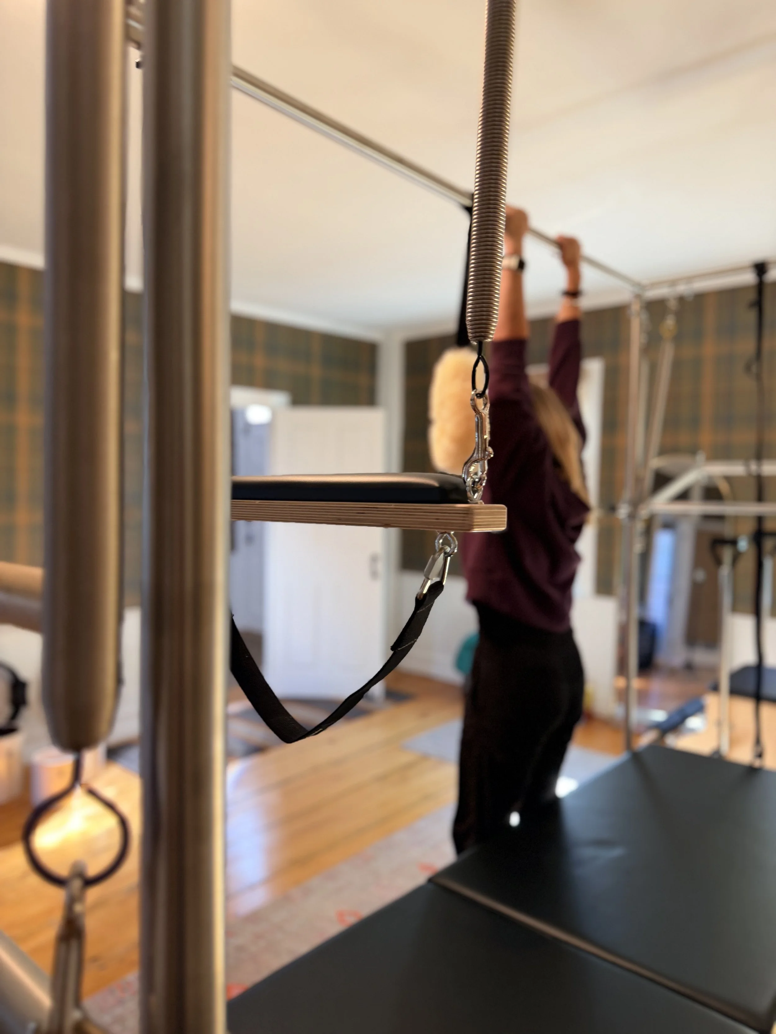
/* PHOTO BAND: Lexi's empty image block under the rows shows the trapeze photo
(IMG_9767, already on the CDN from the Home gallery) under the site's 35% spruce veil.
To change the photo, change the URL. */
section[data-section-id="6ab6adba6f4cbf2dd5172f4c"] .fe-block-yui_3_17_2_1_1790357133211_20098 .sqs-block-content {
background: ~"linear-gradient(rgba(30,39,35,.35), rgba(30,39,35,.35)), url(https://images.squarespace-cdn.com/content/v1/68ed95d9a2bd713a03085daa/576e4192-9a4c-402f-9960-5cc0491d37d2/IMG_9767.jpeg?format=2500w) center 42% / cover no-repeat";
}
section[data-section-id="6ab6adba6f4cbf2dd5172f4c"] .fe-block-yui_3_17_2_1_1790357133211_20098 .sqs-block-content > * {
opacity: 0;
}
/* phones: the stored phone positions put the rows under the panel, so they are pinned here too */
@media (max-width: 767px) {
section[data-section-id="6ab6adba6f4cbf2dd5172f4c"] .fluid-engine {
grid-template-rows: ~"repeat(44, minmax(24px, auto))" !important;
}
section[data-section-id="6ab6adba6f4cbf2dd5172f4c"] .fe-block-c9782fea506ea52ec7a9 { grid-area: ~"1 / 1 / 30 / 11" !important; }
section[data-section-id="6ab6adba6f4cbf2dd5172f4c"] .fe-block-yui_3_17_2_1_1790368264486_2951 { grid-area: ~"2 / 2 / 29 / 10" !important; }
section[data-section-id="6ab6adba6f4cbf2dd5172f4c"] .fe-block-yui_3_17_2_1_1790357133211_20098 { grid-area: ~"31 / 1 / 44 / 11" !important; }
}
/* ---------------------------------------------------------------------
23. PAGE: ABOUT · the closing line
"Strength has a system." sits in a Heading 2 block six columns wide
(Lexi's block); on desktop it stays on one line and centers over the
button like every other CTA. Section 6ab6b080031058244499c232.
--------------------------------------------------------------------- */
@media (min-width: 768px) {
section[data-section-id="6ab6b080031058244499c232"] .fe-block-ebd08542511693129720 :is(.sqs-html-content, .ProseMirror) h2 {
white-space: nowrap !important;
}
section[data-section-id="6ab6b080031058244499c232"] .fe-block-ebd08542511693129720 .sqs-block-content {
overflow: visible;
}
}
/* ---------------------------------------------------------------------
24. PAGE: ABOUT · phone layout of the essay section
Section 6ab6b080031058244499c22a. On phones Squarespace stacked the two
spruce panels first and every text block after them, so the words fell
outside their panels. The phone positions are pinned here in reading
order; desktop is untouched (Lexi's layout).
--------------------------------------------------------------------- */
@media (max-width: 767px) {
section[data-section-id="6ab6b080031058244499c22a"] .fluid-engine {
grid-template-rows: ~"repeat(40, minmax(24px, auto))" !important;
}
section[data-section-id="6ab6b080031058244499c22a"] .fe-block-a8ee98038bb4962b5e45 { grid-area: ~"1 / 1 / 16 / 11" !important; } /* spruce panel 1 */
section[data-section-id="6ab6b080031058244499c22a"] .fe-block-yui_3_17_2_1_1790357702399_57099 { grid-area: ~"2 / 2 / 6 / 10" !important; } /* house drawing */
section[data-section-id="6ab6b080031058244499c22a"] .fe-block-yui_3_17_2_1_1790357702399_11172 { grid-area: ~"6 / 2 / 11 / 10" !important; } /* essay */
section[data-section-id="6ab6b080031058244499c22a"] .fe-block-e5d20973b2b7fe12ab95 { grid-area: ~"11 / 2 / 12 / 10" !important; } /* rule */
section[data-section-id="6ab6b080031058244499c22a"] .fe-block-yui_3_17_2_1_1790357702399_56405 { grid-area: ~"12 / 2 / 15 / 10" !important; } /* built to be that room */
section[data-section-id="6ab6b080031058244499c22a"] .fe-block-yui_3_17_2_1_1790357702399_58273 { grid-area: ~"17 / 2 / 20 / 10" !important; } /* quote */
section[data-section-id="6ab6b080031058244499c22a"] .fe-block-a518829f34a082ee651a { grid-area: ~"21 / 1 / 40 / 11" !important; } /* spruce panel 2 */
section[data-section-id="6ab6b080031058244499c22a"] .fe-block-yui_3_17_2_1_1790357702399_59197 { grid-area: ~"22 / 2 / 28 / 10" !important; } /* Sarah */
section[data-section-id="6ab6b080031058244499c22a"] .fe-block-yui_3_17_2_1_1790357702399_59644 { grid-area: ~"28 / 2 / 34 / 10" !important; } /* what you will find */
section[data-section-id="6ab6b080031058244499c22a"] .fe-block-yui_3_17_2_1_1790357702399_65642 { grid-area: ~"34 / 2 / 35 / 10" !important; } /* rule */
section[data-section-id="6ab6b080031058244499c22a"] .fe-block-yui_3_17_2_1_1790357702399_61749 { grid-area: ~"35 / 2 / 39 / 10" !important; } /* Find your time */
}
/* ---------------------------------------------------------------------
25. PAGE: ABOUT · body text in the two spruce panels
Section 6ab6b080031058244499c22a. The original's essay is regular
16px body copy in soft ink with dash bullets; the pasted blocks came in
small, muted and bold, so the panel text is set here.
--------------------------------------------------------------------- */
section[data-section-id="6ab6b080031058244499c22a"] .sqs-block-html :is(.sqs-html-content, .ProseMirror) p:not(.sqsrte-small),
section[data-section-id="6ab6b080031058244499c22a"] .sqs-block-html :is(.sqs-html-content, .ProseMirror) li {
font-size: 16px;
line-height: 1.6;
color: var(--gp-ink-soft);
}
section[data-section-id="6ab6b080031058244499c22a"] .sqs-block-html :is(.sqs-html-content, .ProseMirror) p:not(.sqsrte-small) strong {
font-weight: 400;
}
section[data-section-id="6ab6b080031058244499c22a"] .sqs-block-html :is(.sqs-html-content, .ProseMirror) p:not(.sqsrte-small) + p {
margin-top: 18px !important;
}
section[data-section-id="6ab6b080031058244499c22a"] .sqs-block-html :is(.sqs-html-content, .ProseMirror) ul {
list-style: none;
padding-left: 0;
margin: 0;
}
section[data-section-id="6ab6b080031058244499c22a"] .sqs-block-html :is(.sqs-html-content, .ProseMirror) li {
list-style: none;
position: relative;
padding-left: 26px;
margin: 0 0 12px !important;
}
section[data-section-id="6ab6b080031058244499c22a"] .sqs-block-html :is(.sqs-html-content, .ProseMirror) li::marker {
content: "";
}
section[data-section-id="6ab6b080031058244499c22a"] .sqs-block-html :is(.sqs-html-content, .ProseMirror) li::before {
content: "";
position: absolute;
left: 0;
top: 0.8em;
width: 14px;
height: 1px;
background: var(--gp-brass);
}
section[data-section-id="6ab6b080031058244499c22a"] .sqs-block-html :is(.sqs-html-content, .ProseMirror) li p { margin: 0 !important; }
/* Squarespace draws its own bullet on the paragraph inside each item; the brass dash above replaces it */
section[data-section-id="6ab6b080031058244499c22a"] .sqs-block-html :is(.sqs-html-content, .ProseMirror) li p::before { content: none !important; display: none !important; }
/* ---------------------------------------------------------------------
26. PAGE: ABOUT · the pull quote on the floral
"Movement is medicine, and the medicine works best in small rooms..."
sits between the two spruce panels. Larger than the site Quote style,
dark ink, and air above and below so it reads as a deliberate pause
(the grid rows grow with it, so the second panel moves down).
--------------------------------------------------------------------- */
section[data-section-id="6ab6b080031058244499c22a"] .fe-block-yui_3_17_2_1_1790357702399_58273 :is(.sqs-html-content, .ProseMirror) :is(blockquote, blockquote p, h2) {
font-family: 'Libre Caslon Text', Georgia, serif;
font-style: italic;
font-weight: 400;
font-size: clamp(28px, 2.9vw, 44px);
line-height: 1.35;
letter-spacing: 0;
color: var(--gp-ink-on-light);
text-align: center;
text-transform: none;
}
section[data-section-id="6ab6b080031058244499c22a"] .fe-block-yui_3_17_2_1_1790357702399_58273 :is(.sqs-html-content, .ProseMirror) :is(blockquote, h2) {
max-width: 26ch;
margin: 0 auto !important;
padding: 64px 0 !important;
}
@media (max-width: 767px) {
section[data-section-id="6ab6b080031058244499c22a"] .fe-block-yui_3_17_2_1_1790357702399_58273 :is(.sqs-html-content, .ProseMirror) :is(blockquote, h2) { padding: 40px 0 !important; }
}
} /* end #siteWrapper */